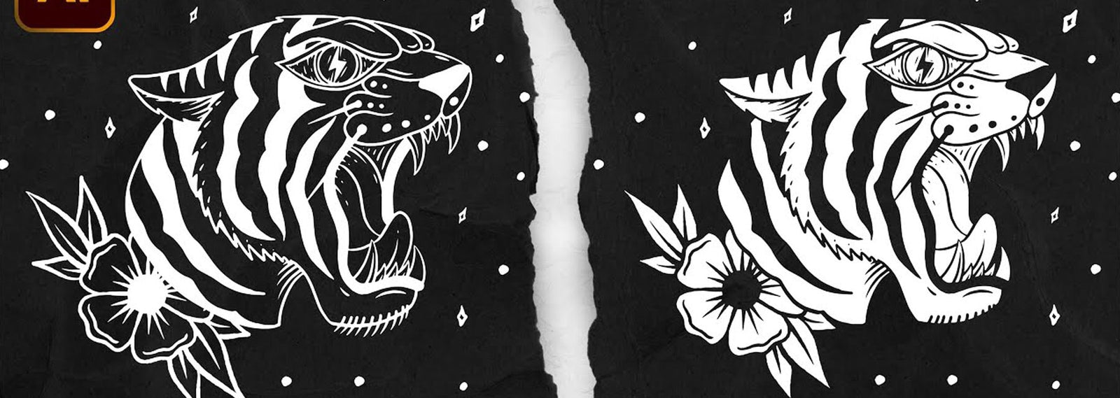
Let’s face it: not all customers send in perfect designs. Sometimes, artwork needs some tweaks (or a complete redo). Say you’re given artwork originally printed on a white background with black lines, but the client wants it printed on black with white lines. Simply changing the black lines to white lines doesn’t always cut it. The artwork looks fine, but not as good as it could look. By inverting the artwork in Adobe Illustrator, you can make your artwork stand out. Cory Romeiser of Golden Press Studio shows you how to invert artwork in Adobe Illustrator to make your life a little easier.
THE PROCESS
Open Illustrator and paste the design in a new document. In the video, Cory plays around with an element from the Stay Wild Vector Pack.
Once your artwork is pasted into a blank document, select the entire image. Using “Command C” and “Command F,” copy and paste the design on top of itself. Lock the bottom layer, so it is immovable.
Select the direct selection tool and delete all inside anchor points. Cory notes that for more detailed designs, using the pen tool and drawing each shape to fill in may be more effective.
RELATED: HOW TO MAKE A T-SHIRT DESIGN IN PROCREATE

Once the anchor points are deleted, select the entire design. Use the Pathfinder and Unite tools to fill the entire design with white.
CHECK OUT MORE ARTWORK
FINISHING TOUCHES
Using “Command” and “Left Bracket,” place the original artwork below the filled-in design. Then, highlight the entire image. Ungroup the images and use “Command 8” to make a compound path, so the artwork merges into a single layer. Highlight the artwork, get your pathfinder tool, and hit “minus front.”

And there you have it. Cory compares the artwork before and after it was inverted. The inverted artwork comes out more crisp than white lines on empty space. Now that you have the know-how, go have some fun with this technique!

