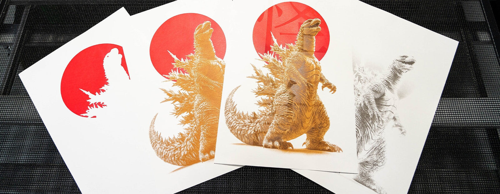
In this episode of Deep Dive with Colin, we are exploring the art of poster printing. While we have spent years focusing on T-shirt printing, poster printing introduces its own unique process. It requires patience, precision, and a willingness to experiment.
For this project, we are creating a four-color Kaiju-themed poster using water-based inks with tight registration. From setting up the vacuum platen to testing finishes, every step provides an opportunity to refine techniques and discover new possibilities.
Join us as we walk through the tools, methods, and insights that make poster printing an exciting and rewarding craft.
THE SETUP
When diving into poster printing, the tools and materials differ significantly from T-shirt printing. We selected equipment and materials tailored for stability and precision:
VACUUM PLATEN
Stability is critical, and this tool kept the paper in place without the risk of tearing.
WATER-BASED INKS
We used Green Galaxy High Solids Water-Based Inks, custom-mixed for vibrant colors.
23x31 SCREENS
These larger screens accommodated the 13"x19" paper size, ensuring ample space for the design.
80 DUROMETER SQUEEGEE
A harder squeegee was ideal for graphic printing on paper.
Stability was a top priority. The vacuum platen, with its ability to eliminate movement, became the centerpiece of the operation.
OVERCOMING CHALLENGES
COLOR DRYING: A TEST OF PATIENCE
Each color required a complete dry before the next could be applied. We opted for a conveyor dryer set at 300°F for three minutes to speed things up. However, this method brought risks of paper shrinkage.

Key Lesson: While conveyor dryers are tempting for quick results, traditional drying racks with airflow are a safer bet for maintaining paper stability.
FINDING THE RIGHT PIGMENT LOAD
The first ink layer, a striking red, turned out blotchy—a clear sign that the pigment load wasn’t high enough. We realized a heavier pigment load (closer to 20%) would provide better coverage on paper.
RELATED: THE SIMPLE TRICK TO MIXING WATER BASED INK
Insight: Poster printing demands precision in ink mixing. A small adjustment can make a world of difference.
MASTERING REGISTRATION
Aligning colors perfectly proved challenging. We used a classic trick: taping the film positive to the platen to check alignment. Adjustments to the off-contact distance and squeegee angle also helped achieve consistency.

Pro Tip: Squeegee pressure and angle must remain consistent to avoid shifts in registration.
RELATED: HOW TO SETUP YOUR PRESS FOR WATER BASED SCREEN PRINTING
EXPERIMENTING WITH A GLOSS FINISH
For a final touch, we experimented with Green Galaxy Stretch Core polyurethane ink to add a subtle gloss effect. The idea was to create a wet-look effect on certain design elements. The result? A barely noticeable but unique sheen that added depth to the poster.

Takeaway: Experimentation is at the heart of learning. Even subtle effects can elevate a project.
THE FINAL PRODUCT
Despite some initial hiccups, we achieved a vibrant, multi-colored Godzilla poster with tight registration. The experience underscored the importance of patience, precision, and a willingness to embrace challenges.

Poster printing is a slower, more meticulous process than T-shirt printing. But the rewards are worth the effort: a stunning, tactile product that feels like art in its own right.
Have a question you want Colin to Dive Deep on? Submit it here!

