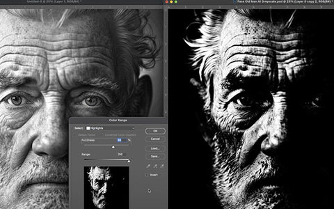
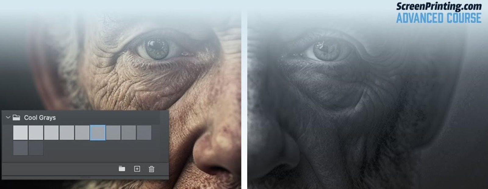
Ever noticed how sometimes a black and white photo hits harder than color? That's the power of grayscale - a monochromatic look and it can take certain designs to new heights. Grayscale separations strip things back to basics - black, white, and the grays in between - and somehow, the result is anything but basic. Let’s look into how this minimalist approach can seriously up your screen printing technique.
MORE THAN MEETS THE EYE
Grayscale is all about using shades (values) of gray instead of multiple colors to create images that are rich in detail and emotion. It's like turning down the noise and letting the true essence of your design shine through. This technique is perfect for adding depth and complexity to your print without the need for a rainbow of color to bring it to life.

RELATED: TIPS FOR ADJUSTING DOT GAIN IN ARTWORK IN ADOBE PHOTOSHOP
THE BACKBONE OF GRAYSCALE
Halftones are the stars of the show in grayscale printing, creating a spectrum of shades with just dots. The closer and bigger the dots, the darker the shade; the smaller and more spaced out, the lighter. Tools like Adobe Photoshop are essential, giving you the control you need to fine-tune these dots and get your shades just right. For those looking to master these techniques, our Adobe Photoshop for Screen Printers is a valuable resource.
RELATED: PHOTSHOP FOR SCREEN PRINTING: ADVANCED COLOR SEPARATIONS
FINDING THE PERFECT SHADE BALANCE
The key to killer grayscale prints is nailing the balance between light and dark. This means choosing the right screens for the job. Use a higher mesh count for those subtle grays that need to whisper rather than shout, and bring out the lower mesh count screens when you need your darks to really pack a punch.

RELATED: HOW TO COLOR SEPARATE BLENDS AND HALFTONES FOR SCREEN PRINTING IN ADOBE ILLUSTRATOR
YOUR NEW BEST FRIEND IN PRINTING
Embracing grayscale is about seeing the big picture through a simplified lens. It challenges you to create something deeply impactful with less, pushing your creativity to new heights. Whether you’re aiming for a subtle touch or a dramatic statement, grayscale separations have got you covered.
By integrating these essential tools and techniques, you’re not just simplifying your design process; you’re opening up new avenues for creativity and expression. Grayscale separations invite you to explore the potential of your designs in a whole new light, making it a valuable addition to your screen printing arsenal.

